OverviewWhat MOTH is
mortenthrane.com ↗

Structural Thinking. Human Outcomes.

MOTH Design System

The personal brand system of Morten Thrane, Lead Product Designer & UX Architect. Tokens, foundations and components for two surfaces: mortenthrane.com and the slides, posts and covers around it.

2 surfacesInter only1 typography foundation4px base grid

01

Overview

One system, rendered through two surfaces. Every rule below is tagged with the surface it applies to.

What MOTH is

A documentation system that proves itself by being built in itself.

MOTH presents senior, systems-level design work to hiring managers, design leads and senior B2B stakeholders with confidence, structure and clarity. Type does the layout work. Every visual element supports the structure.

This app is rendered with the same tokens it documents. The surface toggle in the bar above re-renders every specimen – and this page – in the chosen surface.
How to choose the rules

Start with context, then move from the broadest rule to the component.

  1. Surface: Website uses Website rules only; Slides & social continues to the artefact choice.
  2. Artefact: choose a deck with light content, a dark frame and one colour per section, or a single artefact such as a post, cover, diagram or thumbnail.
  3. Mode for single artefacts: case is dark with Ember focus; AI & experiments is light with Signal focus.
  4. Text colour: choose by size from the contrast table.
  5. Component: apply the matching component rule.

Rule precedence

Specificity wins. Artefact and component rules take precedence over surface and foundation rules where they explicitly deviate.

Artefact dimensions win. Diagram grammar defines structure and marks, not canvas size; an embedded diagram inherits size and layout from its host artefact.

Two surfaces

The toggle changes weight, tracking, casing, rule weight and whether accents are allowed.

Website

mortenthrane.com

  • Inter Medium 500 headings, negative tracking
  • Regular 400 body, sentence case throughout
  • 2px Midnight rule above every section title
  • Sentence-case labels and a monochrome UI
Slides & social

Slides, social, covers

  • Bold 700 / Semi Bold 600 / Regular 400, tracking 0
  • Uppercase eyebrows with a short accent bar above
  • 1px rules are the workhorse
  • Semantic colour with one focal accent per composition

Current surface: Website

02

Foundations

Colour, diagram grammar, type, spacing and shape. Click any swatch or type step to inspect its token.

Color All

Colour is semantic and restrained: one focal accent per composition – Ember in dark cases, Signal in light AI work, the section colour in sectioned decks, none in website UI.

The site's UI uses Midnight, Ink, White and the light ramp. Accents appear inside case images.

Dark ramp

Dark backgrounds and layered surfaces. No shadows.

Light ramp

Light backgrounds, surfaces and structural lines.

Core text

Text roles shared across surfaces.

Contrast belongs to Slides & social
Diagram grammar belongs to Slides & social

Type All

One typography foundation with two modes: Website and Slides & social. Inter only. MOTH uses italics only for quotes in the CV. Elsewhere, rephrase or use weight for emphasis.

The shared type ramp keeps hierarchy consistent. The active mode sets weight, tracking and casing. Website Medium 500 for headings, nav and labels, Regular 400 for body, negative tracking.

Spacing All

4px base grid. Sections breathe.

8Inside chips and tags.
16Between related lines.
24Inside cards.
40Between blocks.
64Between sub-sections.
80Page margins.
120Between sections.

Radius

Scale 8 / 12 / pill, with square full-bleed formats.

8Buttons, inputs, small labels
12UI cards and contained images or thumbnails
pillTags and avatars (not buttons)

12 is for UI cards and contained images or thumbnails. Full-bleed artwork, diagram canvases, slides and pages use 0. Diagram boxes and dashed boundaries also stay square.

03

Components

Shared components rendered through both surfaces, with styling set by the design tokens.

Buttons All

One button, following the site on every surface.

On Midnight, use secondary.

Radius 8 · height 60px · 17px Regular · sentence case with a trailing arrow. Primary Midnight with White text, secondary White with Midnight text. On hover, Midnight shifts to Midnight 2, one step lighter. Signal is not a CTA colour.

Tags belongs to Slides & social
Post byline belongs to Slides & social

04

Templates

Covers, slides and posts. Built from one typography foundation in the Slides & social mode.

Case cover All

Four wordless structure diagrams at 16:9.

  • A wordless structure diagram. 1600×900, exported @3x.
  • The cover contains the diagram object only.
  • One diagram object, slightly off-centre.
  • Dark = client cases, ember tiers. Light = AI & experiments, signal blue.
  • Covers may mark focus with geometry and colour alone, without text labels; the case title beside the cover provides the context.
MIXIT case cover
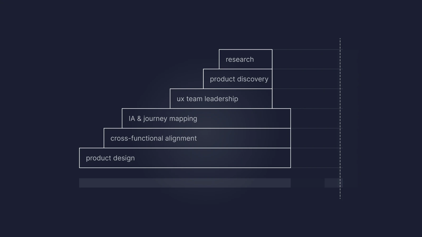
MIXITdark · staircase
GENIECON case cover
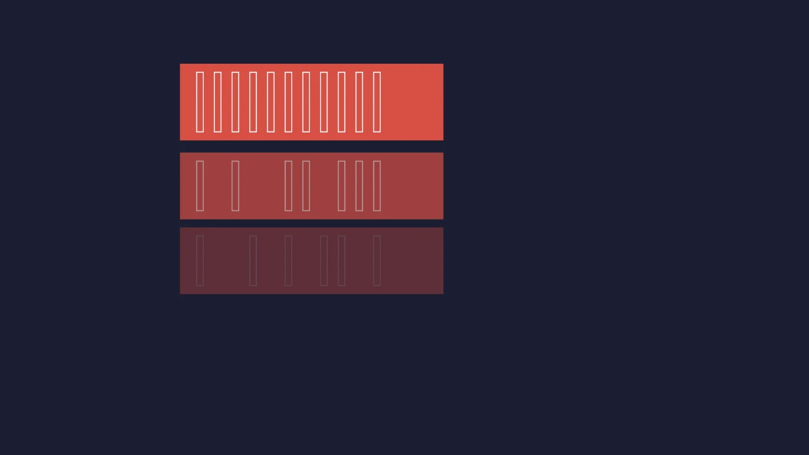
GENIECONdark · tiers
Full Solution case cover
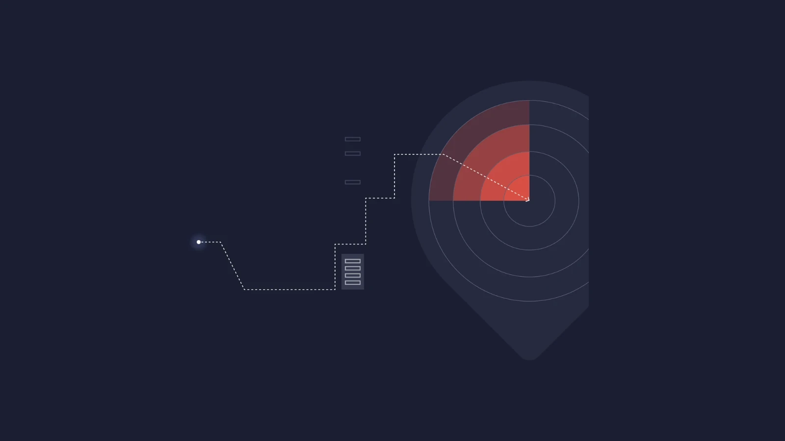
Full Solutiondark · radar
AI × UX case cover
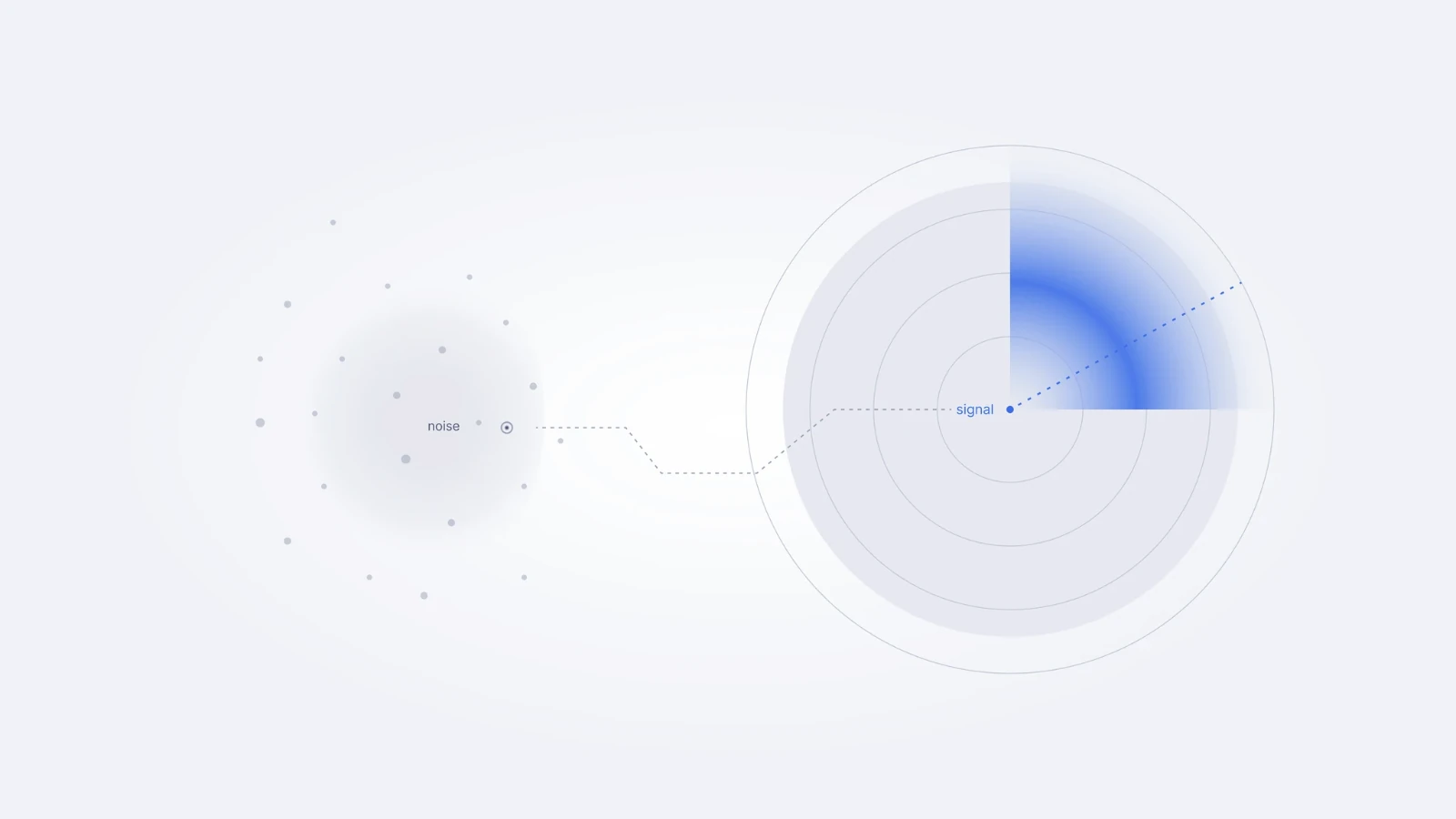
AI × UXlight · noise → signal
Slide patterns belongs to Slides & social
LinkedIn post belongs to Slides & social
CV & application belongs to Slides & social

05

Surfaces

MOTH in the places it lives: the portfolio site and the LinkedIn kit.

Portfolio (mortenthrane.com) Website

A responsive recreation of the live site.

Structural Thinking. Human Outcomes.

Lead Product Designer & UX Architect based near Aarhus – working on complex products, platforms and digital solutions where structure and clarity matter.

Work

AI × UX case cover
AI × UX Turning AI's noise into signals designers can act on
Full Solution case cover
Full Solution Mapping a complete product value chain to create a shared model across European markets
GENIECON case cover
GENIECON Unifying 7 fragmented interaction modes into 1 coherent model
MIXIT case cover
MIXIT Making complex hydronic system control navigable for installers and operations teams

Featured

European Product Design Award 2026

22 Sept 2026

Grundfos GENIECON won the European Product Design Award 2026 in the Industrial category. I worked on the product's UX in 2025 and am credited in the award's design team.

Designplus Award at Light + Building 2026

11 Mar 2026

GRUNDFOS MIXIT received the Designplus Award at Light + Building 2026 in Frankfurt. I contributed to the UX design of MIXIT in 2023–2026, working on making the control of complex hydronic systems understandable for installers and operations teams.

Computer Arts Brand Impact Awards 2015 – Shortlisted

14 Jul 2015

The visual identity for UngK – Youth Church Aarhus was shortlisted in the Public Sector category at the Computer Arts Brand Impact Awards. Award ceremony in London.

About

I'm Morten – a lead product designer and UX architect based near Aarhus. I work on complex products and platforms, where structure and clarity in the design make a real difference to the people using them.

Over the last decade I've worked on some of the most technically and organisationally complex challenges I've encountered – large-scale platform design, unified interaction models across multiple surfaces, cross-functional team alignment, and stakeholder tools used across European markets. The common thread is always the same: making the complex navigable for the people who have to live with it.

I work with AI as a practical part of my design process – using it to explore solution spaces faster, challenge assumptions earlier, and reach better decisions with less friction. Currently open to senior product design, digitalization and digital development roles across eastern and central Jutland.

Experience

Grundfos · Senior UX UI Designer · Digital Solutions, PD CBSJanuary 2023 – June 2026
Grundfos · Senior UX UI Designer · UX UI Design Platform, GT&IJanuary 2022 – December 2022
Kamstrup · Concept & Visual Designer / AD · PM, Water + H/CDecember 2016 – August 2021
Design, Web & Architect Bureaus · Art Director / Copywriter / Designer / 3DJanuary 2007 – November 2016

Skills

  • System design
  • Product design
  • Information architecture
  • AI powered design
  • Product discovery
  • Cross-functional alignment
  • Design operations

Contact

Working on something complex?

I help teams structure systems, align decisions, and make complex products understandable.

Based in Aarhus – open to hybrid, on-site, or remote roles.

LinkedIn
/MI'm Morten – a lead product designer and UX architect based near Aarhus, Denmark.©2026
LinkedIn kit belongs to Slides & social

06

Voice & writing

Calm, structural, specific. The words follow the same rules as the layout.

Voice & writing All

Short do / don't pairs, and a checker to test copy against them.

Sentence caseDo · Mapping the value chainDon't · Mapping The Value Chain (the brand line is the exception)
No em dashDo · Structure first – then screens · next →Don't · Structure first — then screens
No exclamation marksDo · The model shipped.Don't · The model shipped!
No emojiDo · Launch notesDon't · Launch notes 🚀
ItalicsDo · CV quote · *“It emerges from the whole system.”*Don't · Elsewhere · It *emerges* from the whole system.
Numbers as proofDo · Mapped ~1200 IA elementsDon't · Mapped lots of IA elements
Buttons are verbsDo · View the case →Don't · Case
5 issues
  • Em dash – Use a spaced en dash –, a middot · or an arrow →.
  • Exclamation mark – End with a full stop. Let the claim carry itself.
  • Emoji – Remove it. Type and structure do the work.
  • Italic marker – MOTH uses italics only for quotes in the CV. Elsewhere, rephrase or use weight for emphasis.
  • Title Case headline: "Why Trust Is The New Interface" – Use sentence case – capitalise the first word only.

07

Changelog

Every change to MOTH, newest first. Keep a Changelog format, semantic versioning.

Releases

Unreleased

Changed

  • The Case description Context copy continues for several full-width lines below its floated image.
  • Radius specimens keep three equal boxes with independently wrapping captions, and the Case description demonstrates text wrapping beside and below its image.
  • The left rail groups expand and collapse, with a Collapse all / Expand all control, remembered state and auto-opening of the active group.
  • Slides & social pages no longer scroll sideways at desktop widths.
  • Short terms stay on one line: wider rail with right-aligned surface tags, and one-line rail labels, buttons, table headers, tags, radius captions and portfolio skills.

2.2.0

2026-09-30

Added

  • CV & application templates for CV pages, cover letters, case descriptions and case covers.
  • Diagram grammar with six content-led structures, a mark legend and composition rules for dark and light work.
  • LinkedIn post templates and a kit for square, portrait, text and diagram formats, plus published examples and a separate cover format.
  • Eight 1920×1080 slide patterns with section colours, thumbnail previews and a focused large view.
  • A complete Slides & social typography scale for 1920×1080 artefacts.
  • Overview guidance for choosing rules by surface, artefact, mode, text size and component, including rule precedence.

Changed

  • The colour system uses unified names, accent and Shadow pairs, Dark accent, section colours and one five-column specimen grid.
  • Contrast roles distinguish normal text, large text and graphics on light and dark surfaces, with darker accent partners for small text.
  • Radius follows one 8 / 12 / pill scale across both surfaces, while diagram boxes and full-bleed artefacts stay square.
  • The showcase presents Website and Slides & social rules through one surface-aware navigation and component system.
  • MOTH uses italics only for quotes in the CV. Elsewhere, copy uses weight or rephrasing for emphasis.

Removed

  • Pill buttons.

2.1.0

2026-09-30

Added

  • MOTH Showcase app: rail navigation, "you are here" bar, Website | Slides & social toggle, Foundations and Components.
  • This changelog.

2.0.0

2026-09-29

Changed

  • MOTH is split into two surfaces: Website (mortenthrane.com) and Slides & social. Every rule is tagged Website, Slides & social or All.
  • Website typography follows the live site: Inter Medium 500 headings and Regular 400 body with negative tracking.
  • Slides & social typography: Bold 700 / Semi Bold 600 / Regular 400, tracking 0. The only exception is the section-divider number (−5%).
  • Radius scale is 6 / 8 / 12 / 16 / pill. 14 is removed. 16 is slide cards only; cards and images are 12.
  • Buttons follow the site: radius 8, 60px, 17px Regular with a trailing →. Primary navy, secondary white.
  • Website rules are 2px navy; slide rules are 1px.
  • /M is the logo on the website and the sender everywhere else, once, at the end.
  • A Case cover is a wordless structure diagram, 1600×900, exported @3x.

Added

  • Sectioned decks: one colour per section (01 Ember, 02 Signal, 03 Amber, 04 Midnight/Periwinkle), with graphic vs. text colour rules.
  • Section divider and Section index slide patterns.
  • Contrast notes for Amber – Shadow (≈2.3:1) and Periwinkle (≈3.8:1).

Deprecated

  • Pill buttons (kept only as a deprecated prop for old artefacts).

Removed

  • Italics from the entire system.